Uber Recs

What if drivers recommend their hometowns to tourist riders through the Uber app?
Team:
3 GT-HCI students,
Ning, M., Michael, Y. (Uber)
Role:
Researcher, Designer,
Product Strategy
Duration:
10 months
Aug. 2024 - Jun. 2025
Problem Space
Tourists are struggling
We reviewed 10 academic papers on tourist decision-making models, and conducted interviews with 10 travelers, uncovering 3 key problems they commonly face.
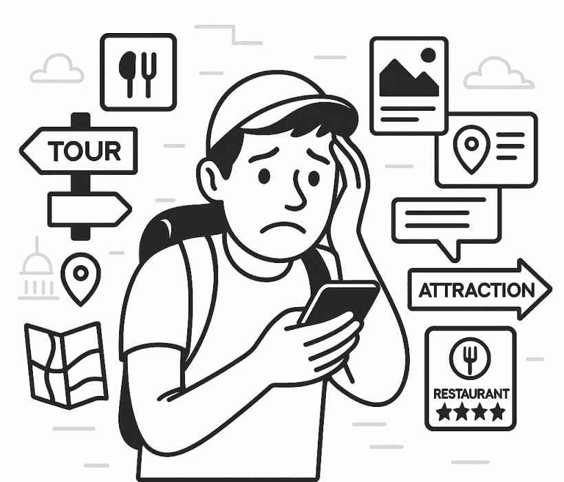
Information Overload
Trust and Credibility

Uncertain Conditions
Uber Drivers and Tourist Riders
When riders travel to a new city, they often crave authentic local experiences, but they lack personal connections. On the flip side, drivers know and love their city. They want to share it, but don’t have a clear or comfortable way to do so. Both sides want to connect, but right now, there’s no smooth or reliable way to make that happen.

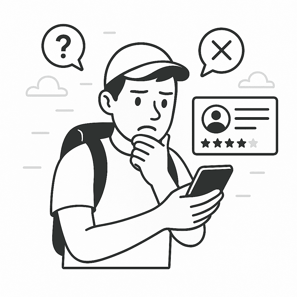
Tourist Riders
Have no personal connections with locals of the city they are visiting
Know and love their city, but have no clear way to share it
Unsure whether locals are willing or available to offer recommendations
Worry that their recommendations may be unsolicited
Interacting with locals can be unpredictable, awkward, and rarely documented
Struggle to fully convey their recommendations while driving
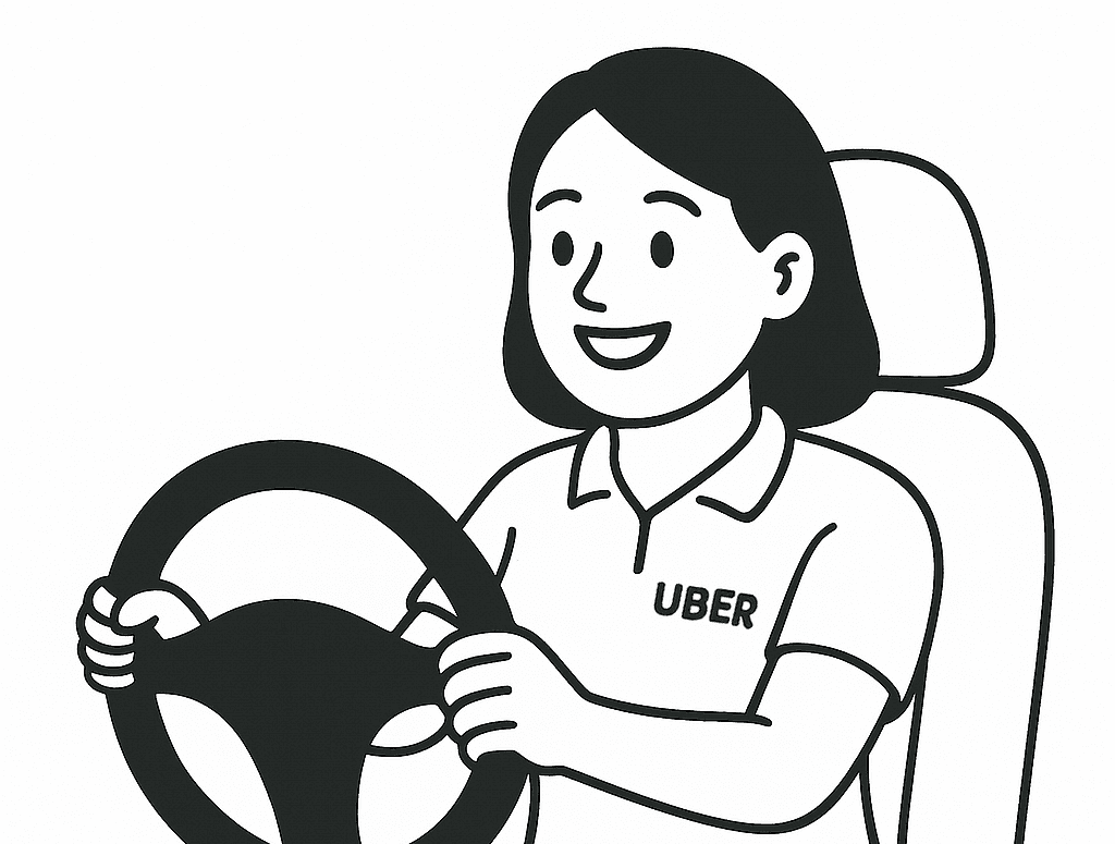
Uber Drivers

How might we
design for tourist riders to receive and retain local insights from Uber drivers, supporting in-car interactions and encouraging future Uber usage through saved, actionable recommendations?
Research Question
Why Uber?
What unique assets does Uber have that could be transformed into a competitive advantage in tourism?
Research Question
What types of travel recommendations do Uber users prefer, and what issues do they face with existing options?
Research Question
What are the current user journeys and behaviors when researching places of interest and making planning decisions?
Research Question
How do users respond to unexpected situations during travel, and what factors influence their final decisions?
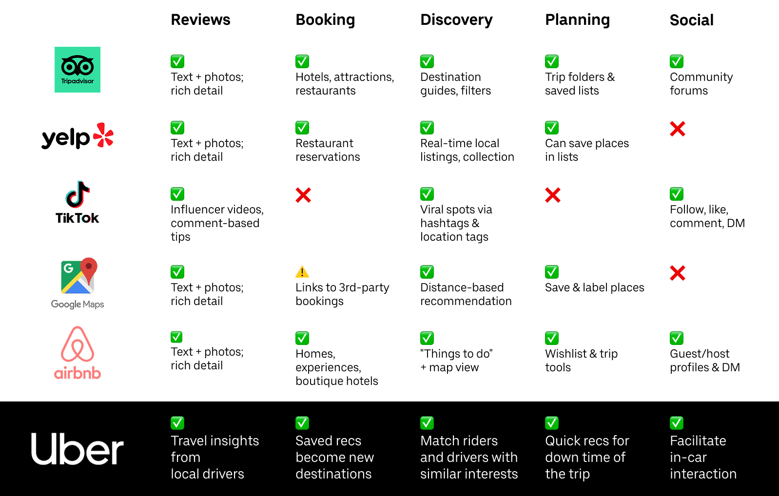
Market Analysis
Research Finding
Localness
Aside from Airbnb, no existing platforms truly rely on locals for insights. Uber is uniquely positioned to do so through its network of local drivers.
Design Implication
Designing for this potential means reimagining the ride not just as transportation, but as a moment of cultural exchange and discovery.
Survey
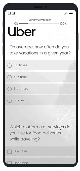
215
Participants
20+
Platforms
Distributed
21
Total
Questions
100%
Completion
Rate
Research Finding
Localness
95% want recs from locals; 82% of those request recs from Uber drivers
Experiencing the locals’ lifestyle/customs provides an immersive travel experience that improves users fulfilment while traveling
Design Implication
Design methods that encourage local drivers to share travel insights, and enable users to easily discover hidden gems
Research Finding
Curate
Users prefer a few very personalized recommendations tailored to their trip purpose
Users are overwhelmed with too many platforms and options to choose from when planning. Showing users too many options is not helping
Design Implication
Help users focus on fewer, high-quality options, and provide sources of recommendation
Task Observation
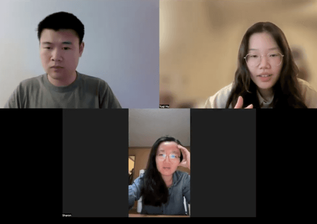
Who: 5 participants of different travel styles, selected based on the survey. Why: Focused, observable behaviors for between-group comparison. What: Participants were given a travel-planning task with unexpected situations. We observed their tools and decision-making processes
Research Finding
Consensus: users rely on a consensus of reviews, ratings, and comments as social proof, yet they are susceptible to detailed negative feedback contradicting the consensus
Users are concerned about the authenticity of a positive consensus, but a large number of reviews helps alleviate this concern. Detailed negative feedback feels more personal than the generalized tone of positive reviews, and may create doubt about the consensus.
Design Implication
Similar recommendations should be grouped to provide social proof
Uber drivers and their recommendations should be verified to ensure they are trustworthy and authentically local
Diary Study

Who: 6 participants who were on vacation at the time. Why: real unexpected travel situations over a longer period. What: Participants were given a daily diary template, and self-report their decision-making processes during unexpected situations
Research Finding
Spontaneous: users often enjoy spontaneous exploration, discovering places of interest along their planned travel routes.
Travelers often deviate from their scheduled itinerary and end up filling in the gaps with activities nearby. They are open to unanticipated adventures and detours, which add a sense of impulsivity that they enjoy.
Design Implication
Design systems that suggest real-time, context-aware recommendations along the user’s route to help fill unexpected schedule gaps
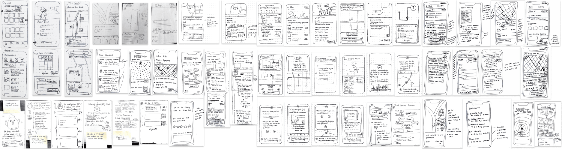
Brainstorm and Ideation
Combined strategies are needed here
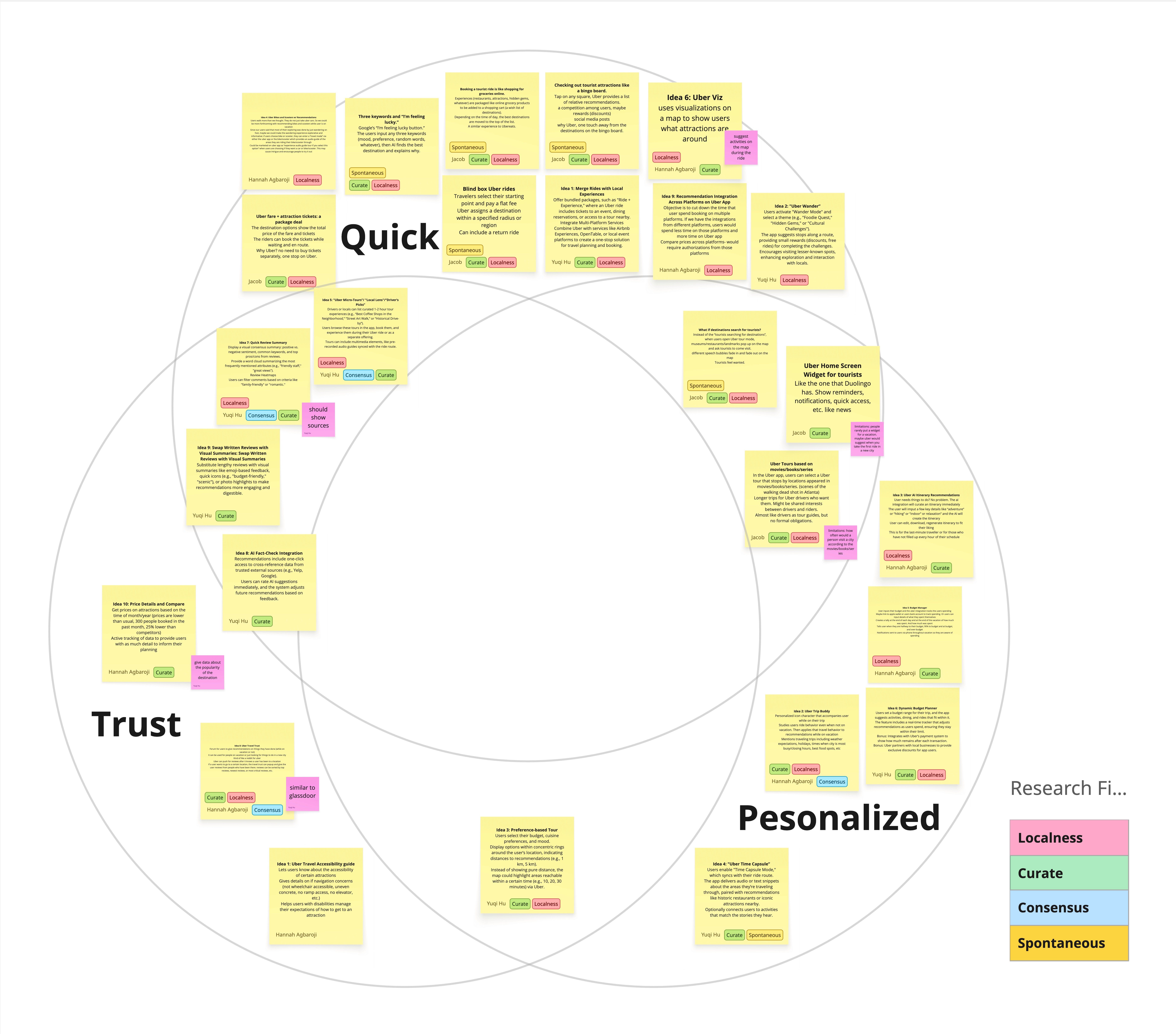
Three Themes
The three tourist challenges were translated into three themes for ideation. Each team member generated 10 design concepts inspired by research findings, and all ideas were categorized under the three core themes as shown in the Venn diagram. While many ideas successfully covered two themes, none fully encompassed all three. We realized that addressing them all would require a combination of strategies. Following the brainstorming session, each team member selected five design ideas with the most potential and developed sketches to better understand how these ideas could fit within the context of the Uber app.
Information Overload
Personalized
Trust and Credibility
Trust
Uncertain Conditions
Quick
Concept Testing - Round 1
We selected three concepts that were well-received by participants during concept testing round one. The first concept recommends points of interest (POIs) along the rider’s current route. The second reimagines POI selection through a dating app–style swiping interface. The third replaces traditional ratings and reviews with insights drawn from Uber’s unique trip data. While none of these concepts alone became the final product, each contributed critical elements to the overall solution.
Concept Testing - Round 2
Rider experience product flow: after gathering feedback from the first round of testing, we developed new sketches that began shaping end-to-end product flows. One flow focused specifically on the in-ride experience, mapping the full journey of a first-time user interacting with what would later become known as Uber Recs. This work marked the initial formation of the Uber Recs experience.

Driver experience product flow: we also developed a flow for the driver side, specifically within the driver app, exploring how local insights and recommendations could be prompted from drivers without adding significant burden. However, due to time constraints, the project scope was limited to focusing solely on the rider-side experience.

Final Concept
We translated the envisioned experience into concrete steps, procedures, and interface elements needed to support it. The flow diagram outlines the full user journey. This exercise helped identify the critical decision points, interface needs, and system triggers required to make the experience feel seamless and intuitive. With a clear understanding of both user flow and system behavior, we were ready to proceed to developing the high-fidelity prototype.

Challenges and Iterations

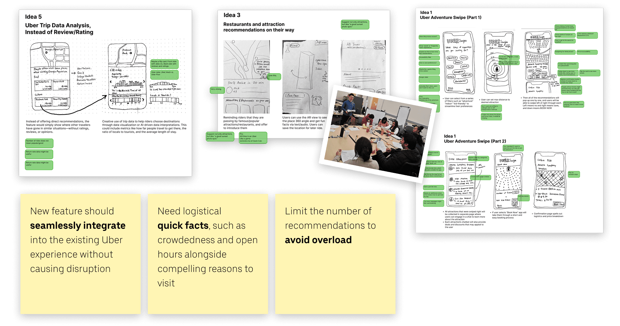
Current Ride-booking Page
Design Goal
Add Uber Recs into the flow.
Keep it simple and intuitive.
Iteration 1.0

Iteration 1.1
Solution 1
Each ride option (UberX, Black, etc.) includes a dropdown menu that lets users choose from nearby drivers.

Iteration 2.0
Solution 2
Display available drivers directly under each ride option, without adding a Recs mode toggle.

Iteration 3.0
Solution 3
All existing ride options remain unchanged, and users can simply choose drivers from a separate section called Uber Recs.

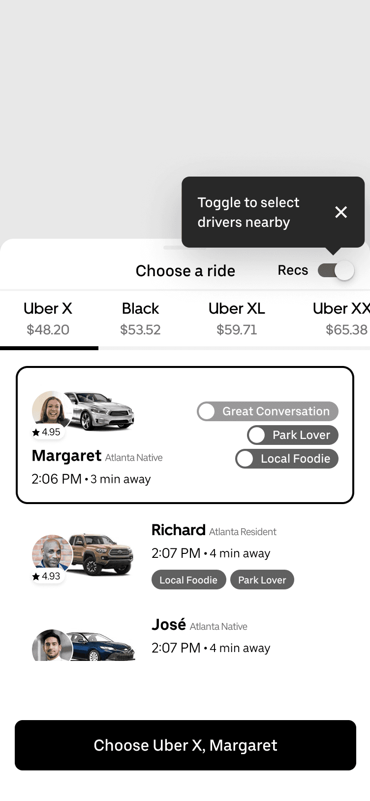
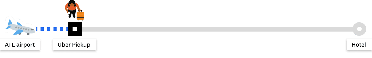
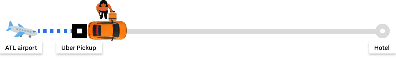
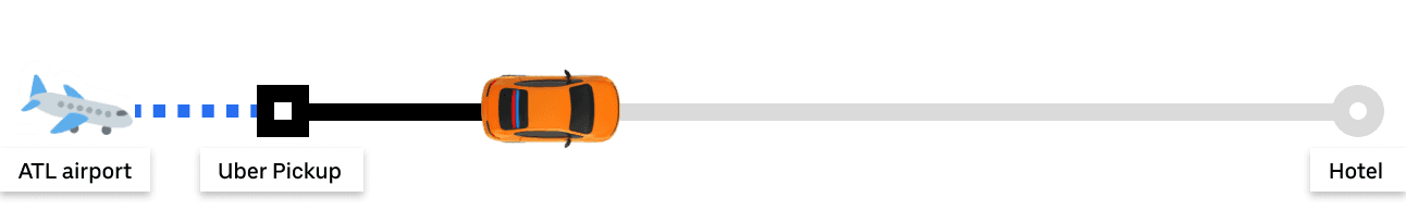
Open Uber at airport rideshare pickup
Book a ride to hotel with Uber Recs
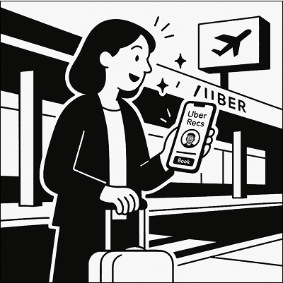
Wait for pickup and view driver profile

Save driver recommendations

Approaching en-route recommendations

Book a ride with saved recommendations

Localness
Unlike generic tour apps, Uber Recs curates authentic insights sourced directly from local drivers.
Curation
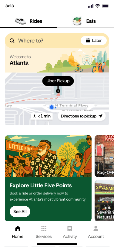
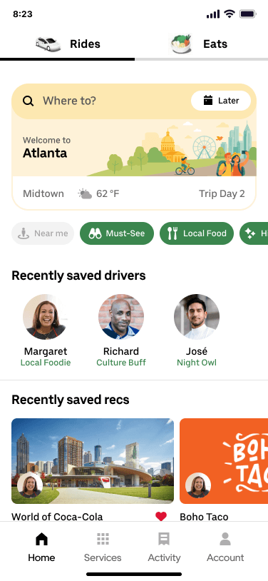
When riders first arrive in a new city, their initial interaction with Uber Recs is designed to feel welcoming and inspiring. We introduce a specialized homepage that captures the local atmosphere, helping set the tone for exploration and putting riders into a "trip mode" mindset.
Spontaneity
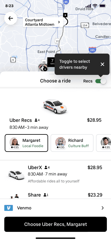
In Recs Mode, riders book rides as usual, with an added option to choose a driver who shares their interests, like food or art, for spontaneous, personalized recs.

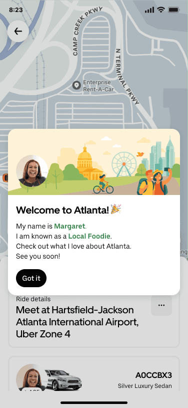

Curation
While waiting for the car to arrive, users receive a personalized greeting card introducing the driver. They also have the option to view the driver's detailed profile. This touchpoint is designed to help break the ice and facilitate more natural conversation once the ride begins.
Localness
In Recs Mode, the driver profile highlights the driver's local roots and lived experiences.
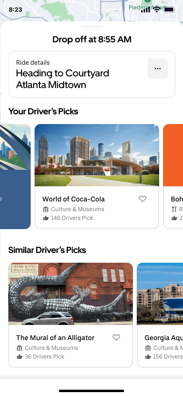

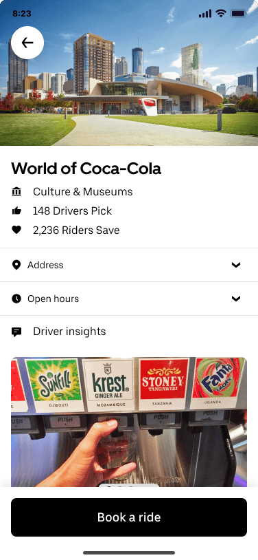
Curation
In addition to the current driver’s recs, users can also view suggestions from other drivers who share their travel preferences.
Consensus
Alongside the driver’s personal take on recommended POIs, the system shows how many other drivers have recommended the place and how many users have saved it. Similar reasons are grouped to reflect a broader consensus.


Spontaneity
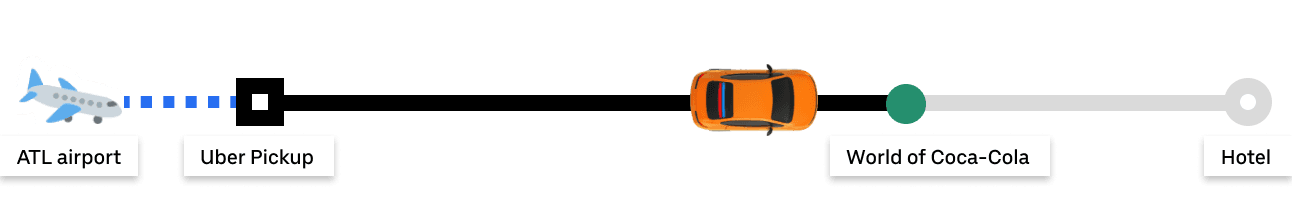
If driver recs are on or near the route, they appear on the map. As the ride progresses, riders get notified just before passing a suggested spot, encouraging spontaneous discovery. The tipping page reminds users of the driver's recs, encouraging tips and offering another opportunity to save any they missed during the ride.

Notification on lock screen


Spontaneity
The following day, when considering where to explore, riders can easily recall saved recs suggested by their driver. From the homepage, riders can quickly book a ride to the saved destination, reducing the need for extensive research.
Localness
Users can also save drivers to explore their full list of recs. Discovering destinations through a trusted local adds a sense of authenticity and connection that goes beyond browsing generic reviews.
Usability Testing
Overall Process Summary
👥
Recruited 12 participants.
9 frequent Uber riders, 3 former Uber drivers.
📱
Prototype was presented on a smartphone at high fidelity; users were encouraged to think aloud.
🤔
Users were not introduced to Uber Recs up front which allowed for observation of organic discovery.
💬
Each session ended with a semi-structured interview covering usability and expectations.
Task 1: Discover Uber Recs
Scenario: Users arrive at Atlanta airport and are booking a ride to their hotel.
Objective: Observe if users organically notice and interact with Uber Recs without prior introduction.
Task 2: Converse with the Driver
Scenario: A team member role-plays as the Uber driver during ride.
Objective: Observe if and how Uber Recs enables natural rider-driver conversations.
Task 3: Act on Saved Recs
Scenario: Users decide where to visit the next day in their hotel rooms.
Objective: Observe if users can find saved content and book a ride to it.
Localness
Test Finding
Users were drawn to recommendations from locals.
10/12 users (83%) trusted recommendations more when accompanied by a personal quote or a photo of the driver. Many described this as “real” or “memorable.”
Experts warned that personal narratives might risk discrimination during driver selection.
Experts highlighted the need for ethical safeguards if rider preferences or driver attributes are surfaced too explicitly.
Curation
Test Finding
Fewer, clearer recommendations helped, but not all users agree on how few is few enough.
11/12 users (92%) described the 3-recommendation format as “digestible,” “low-pressure,” and “easy to remember.” One user called the list “weirdly limited.” “There’s no way those are the only cool places nearby.”
Some users found driver-centered recommendations too heavy.
They preferred general suggestions that didn’t require interpreting the driver’s background or taste.
Consensus
Test Finding
Users seek social consensus, but only when it aligns with their own gut feeling.
7/12 users (58%) said they trusted recommendations more when grouped under “# of Drivers Picked This.” However, 9/12 (75%) disregarded the most popular recommendation and questioned the consensus.
Users instinctively look for negative reviews to "balance the story."
4/12 users (33%) demanded negative reviews, even though they found the layered consensus helpful.
Spontaneity
Test Finding
Users welcomed recommendations that popped up mid-ride, until it felt like too much.
7/12 participants (58%) saved or tapped on a recommendation when it appeared just before passing it.
One user said the pop-ups felt “like a nudge I didn’t ask for.”
Another asked for more control: “I want to decide when I’m in ‘spontaneous mode’, not have it assume I always am.”
Future Directions
👥
Accessibility - audio option
Some users experience motion sickness from looking at a screen in car and might benefit from an audio option narrating the recommendations.
👥
Incentives & Compensation
Incentives and compensations were considered in the project, but they were not incorporated into the prototype. Different models might affect key factors like local insights data source or target users.
👥
Private driver option
Some users expressed the interest in the possibility of booking a driver for full time. Drivers also told that it could bring more income.
Reflection
The Driver as a Feature
At the start of this project, I couldn’t stop thinking about how gig workers (Uber drivers) are often framed as logistics, not people. Uber has long wrestled with the ambiguity of whether drivers are partners, workers, or something in between. That tension became our design material. We weren’t just designing interfaces for riders. We were designing invitations for drivers who would become storytellers, curators, and co-creators of the ride.
But reality set in fast. Drivers have different motivations: some want to connect, others just want to get paid. Riders bring their own personalities into the car. And while the vision was bold, our MVP had to be humble. We debated where to start, what features to keep optional, and how to scaffold toward our big goal without overpromising intimacy.
I learned that meaningful UX isn’t just about designing for people. It’s about designing between people. It’s messy. It’s political. And it forces you to accept that no matter how elegant your prototype, real relationships are built in phases.